The content of the article:
- 1 Appearance of the mobile version of VK
- 2 Logging into the mobile version of VK on a computer through Google Chrome
- 2.1 Choose a gadget
- 2.2 Set the page scale and other values
Appearance of the mobile version of VK
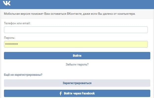
In addition to saving traffic, a lightweight version of the site helps “Unload” a PC with poor performance. To log on mobile version of VK through a PC, just type the address in the format https://m.vk.com/, not https://vk.com/. Appears before us simplified (in comparison with the full computer version) interface. There are necessary fields for entering the phone or e-mail used as login and password. No extra information, no pictures.
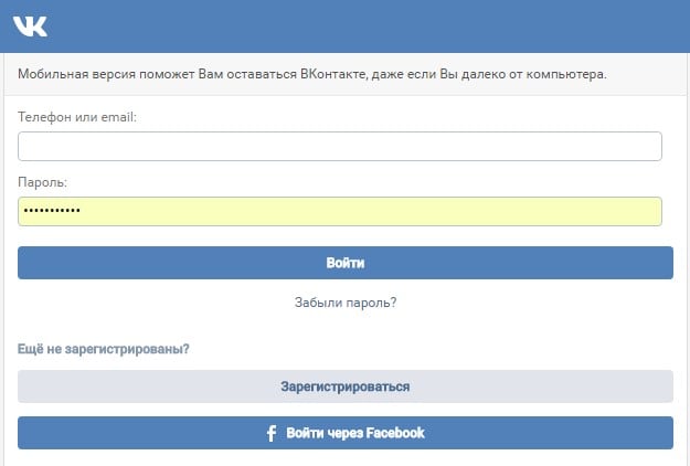
Credential Fields
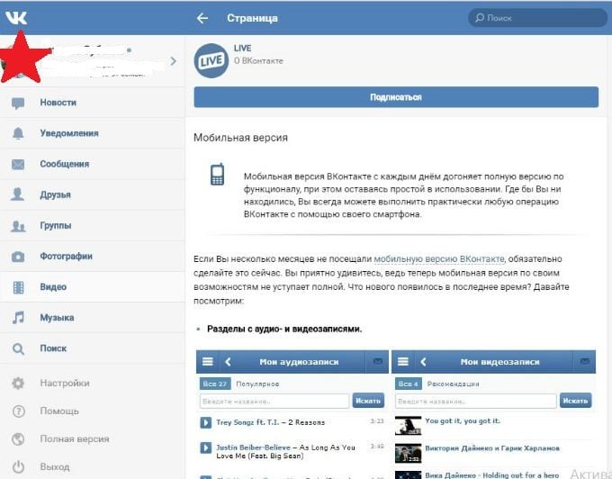
Enter your credentials and get to the main page. Here we see the site as it appears on a tablet or other mobile device. All features available, page loading very fast, navigation is convenient.
In the mobile version of VK, through a computer, you can:
- chat with friends;
- View videos
- get acquainted with new comments and answers in the section “Notifications”;
- read information in groups;
- listen to music and more.
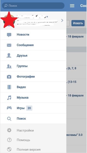
To the disappointment of gamers, the version for smartphones do not start games and applications. The way out is to use the full version for this. site. No need to open a new tab and enter the address again, just click on the “Full Version” button at the very bottom of the column with section names, which is located on the page on the left.
Display VK Lite Site
But this is not the only way to access the mobile version of VK through the computer.
I recommend: Listen to VK music without going into it.
Logging into the mobile version of VK on a computer through Google Chrome
If a user prefers a browser for browsing the Internet Google Chrome and wants to view VK in the mobile version then You can apply the developer tools. They open in the following ways:
- F12 key
- a combination of buttons Ctrl + Shift + I;
- menu entry (three vertical dots in the upper right corner site), then “Additional Tools” and “Tools developer. ”
Then you need to simultaneously press Ctrl + Shift + M or click by the Toggle device toolbar icon.
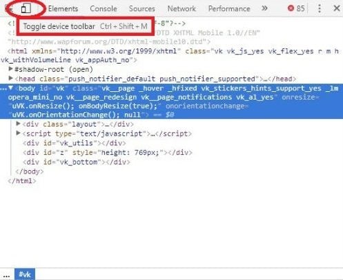
Open Toggle device toolbar
As a result of these actions, the page will be displayed just like on the screen of a mobile device. Even if before we used the full version of the site, it will automatically throw us on the mobile.
Display page as on phone screen
If we want to get an exact copy of the screen of our tablet, iPhone, smartphone, iPad, etc., then above the display the mobile version of VKontakte has a menu where you can select familiar gadget and customize the page to your preference.
See also: How to look in VK, whom a friend added to friends.
Choose a gadget
Now we will select the gadget screen in which we are most satisfied with the display of the mobile version of VK. We look at the top panel above the site page. In our case, the Galaxy S5 is selected. If we prefer another device, then click on the arrow next to the name of the gadget and in the drop-down list, click on the desired models.
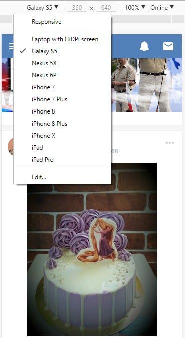
Choose a gadget
Is this not enough? At the bottom of the list there is an Edit button, with clicking on which opens a list of various mobile devices. Put checkmarks in front of the smartphone models we need, iPhones, tablets, than adding them to the main list for subsequent selection.
Set page scale and other values
After the names of the gadgets and screen resolution settings we see zoom – the scale is set within 50-150% (after clicking on arrow next to the set value). In the next tab VK mobile page can be disconnected from the Internet (offline mode) and reconnect (online). And finally by clicking on the icon rotation, we rotate the open site window in a way that is convenient for us – in vertical or horizontal position.
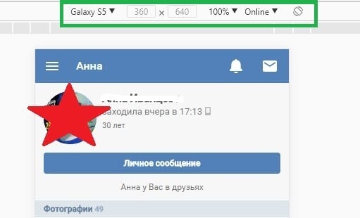
Manage the display area
The cursor in the mobile version of VK is a small circle gray color. This size is enough to accurately select the desired sections. The page scrolls either with the wheel mouse, or by capturing and moving paintwork. Toolbar the developer should not be closed since it will disappear with it screen of the selected mobile device.
The same way to display the mobile version of VK on a computer can be applied in Yandex.Browser. There is only one difference – in calling developer tools from the main menu. Need to go into it (three horizontal stripes in the upper right corner of the page), then “Advanced” → ”Advanced Tools” → ”Tools developer. ” F12 button and Ctrl + Shift + I work the same as in Google Chrome.
Thus, you can enter the mobile version of VK not only with familiar gadget, but also through a computer.